
2024
Artificial Intelligence
Abstractive Health is on a mission to reduce Healthcare professionals burnout. It's medical-grade AI tool automatically condenses entire patient histories into concise health summaries within seconds.
We worked on the brand strategy, rebranding and digital strategy for Abstractive Health. Our goal was to create a cohesive and compelling brand presence that not only highlights the innovative technology but also resonates with healthcare professionals, patients and investors.
The visual identity is developed around the concept of abstractive summarization, which involves synthesizing a text or document using words not included in the original source. This summarization is represented through abstract forms that replace the original text, providing a short and direct summary. The same system is used to create the new symbol, which features a lowercase 'a' formed by two overlapping squares.
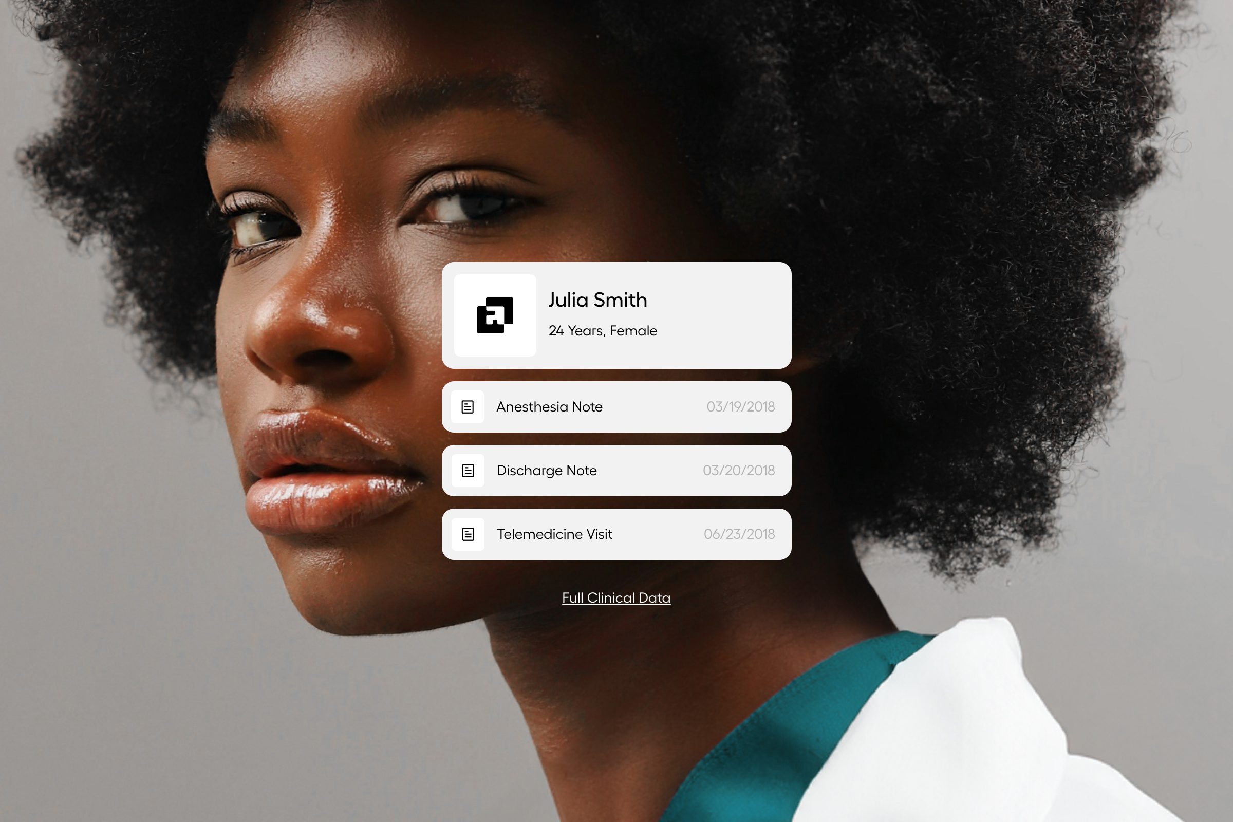
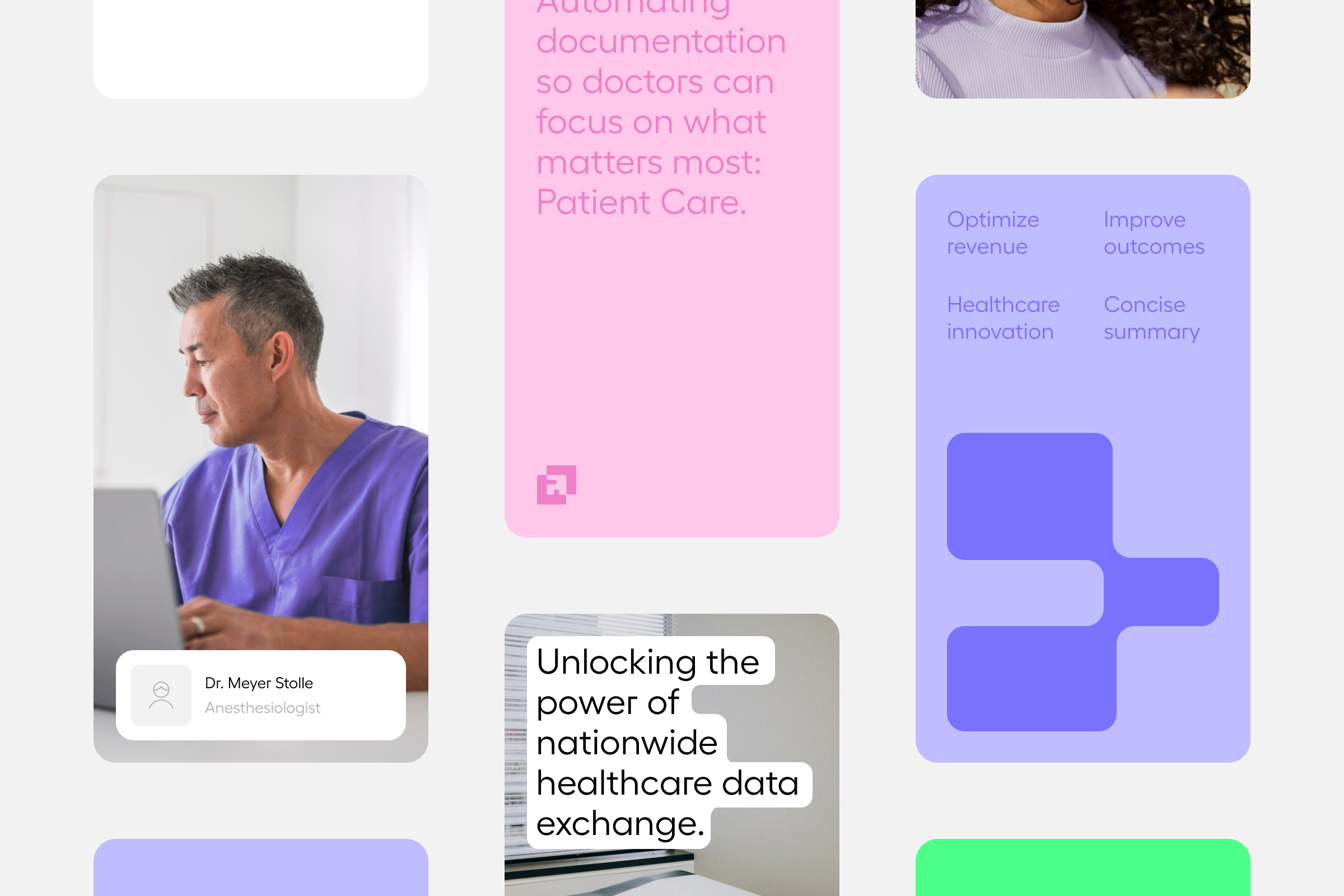
One of the goals of the rebranding was to humanize a technology that might otherwise seem cold and impersonal. The friendly and approachable color palette helps to humanize and connect this technology with healthcare professionals while maintaining its technological and progressive essence.
VISIT ABSTRACTIVE HEALTH
www.abstractivehealth.com
Like what you see?
Contact us for enquiries or just to say hola!
Account direction
Victor Mubien
Creative Direction
David Mubien
Motion
Daniel Iglesias
Art Direction
Daniel Iglesias, Javier Ochoa, Carlos Almagro, Luana Laso, Patri Orden
UX/UI
Javier Ochoa, Patri Orden, Luana Laso
Development
Ángel Perez, Hernán Jensen
Content Strategy
Clara Masip, Holly Meikle

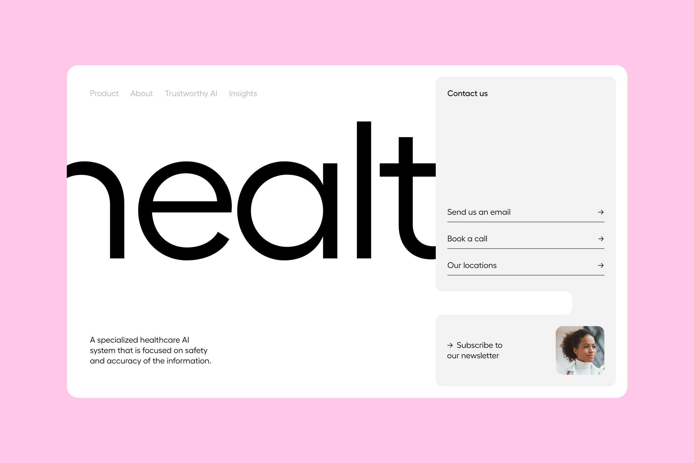
We worked on the brand strategy, rebranding and digital strategy for Abstractive Health. Our goal was to create a cohesive and compelling brand presence that not only highlights the innovative technology but also resonates with healthcare professionals, patients and investors.

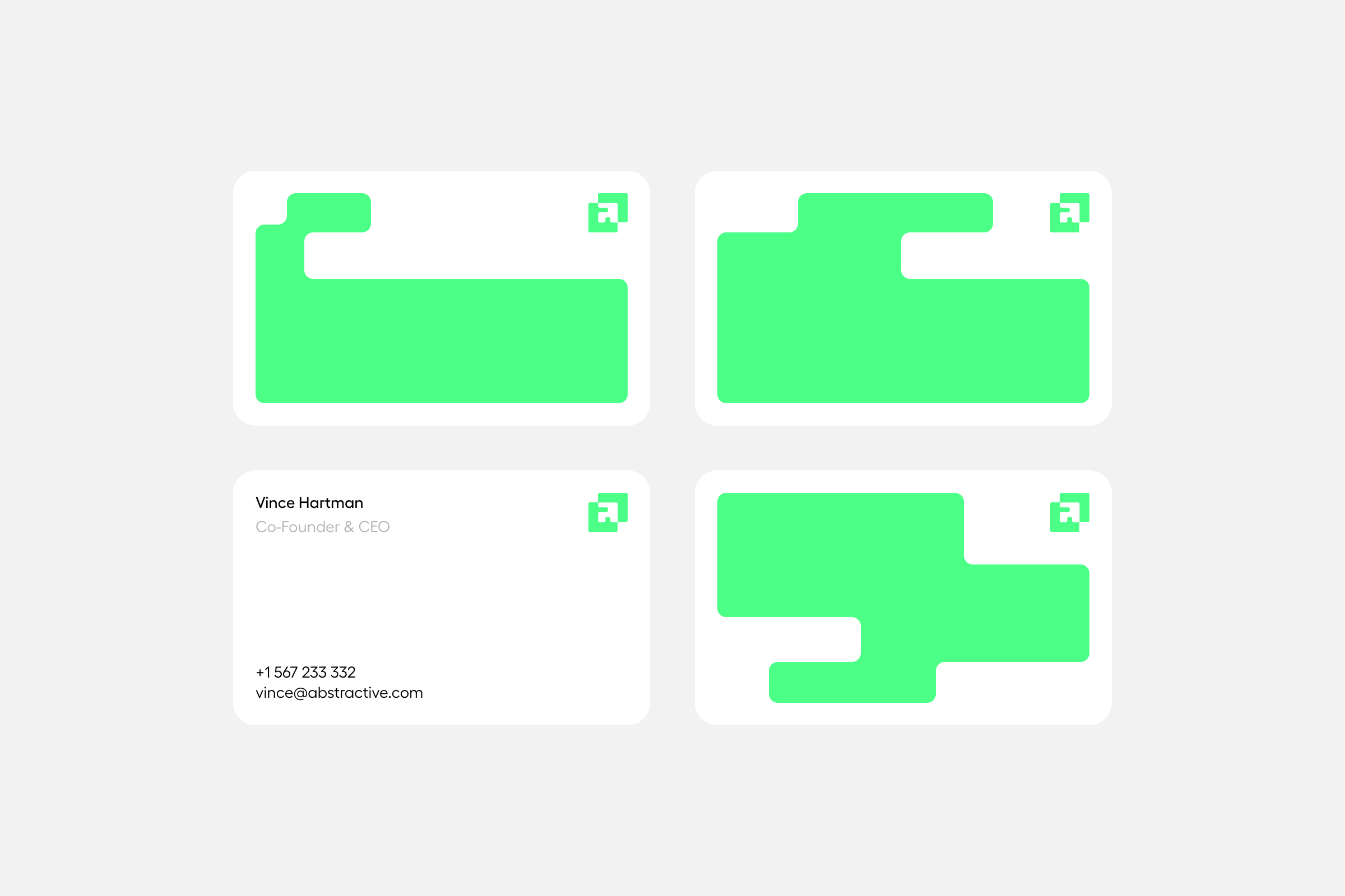
The visual identity is developed around the concept of abstractive summarization, which involves synthesizing a text or document using words not included in the original source. This summarization is represented through abstract forms that replace the original text, providing a short and direct summary. The same system is used to create the new symbol, which features a lowercase 'a' formed by two overlapping squares.


One of the goals of the rebranding was to humanize a technology that might otherwise seem cold and impersonal. The friendly and approachable color palette helps to humanize and connect this technology with healthcare professionals while maintaining its technological and progressive essence.

VISIT ABSTRACTIVE HEALTH
www.abstractivehealth.com



Account direction
Victor Mubien
Creative Direction
David Mubien
Motion
Daniel Iglesias
Art Direction
Daniel Iglesias, Javier Ochoa, Carlos Almagro, Luana Laso, Patri Orden
UX/UI
Javier Ochoa, Patri Orden, Luana Laso
Development
Ángel Perez, Hernán Jensen
Content Strategy
Clara Masip, Holly Meikle