2026
Branding and Website
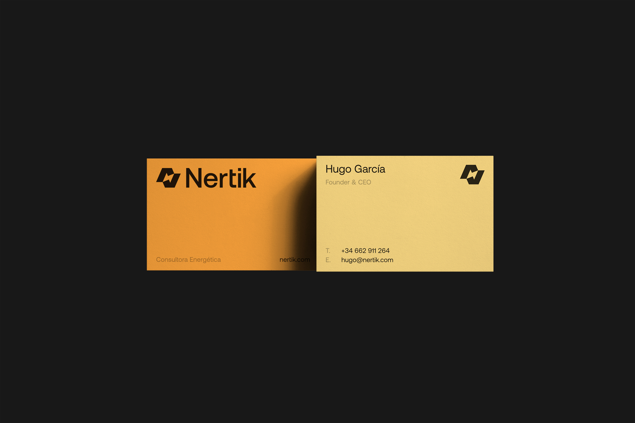
Nertik is an energy consultancy that helps businesses understand, manage, and reduce their electricity and gas costs. This was a comprehensive project where we developed the naming, brand identity, and website design and development.
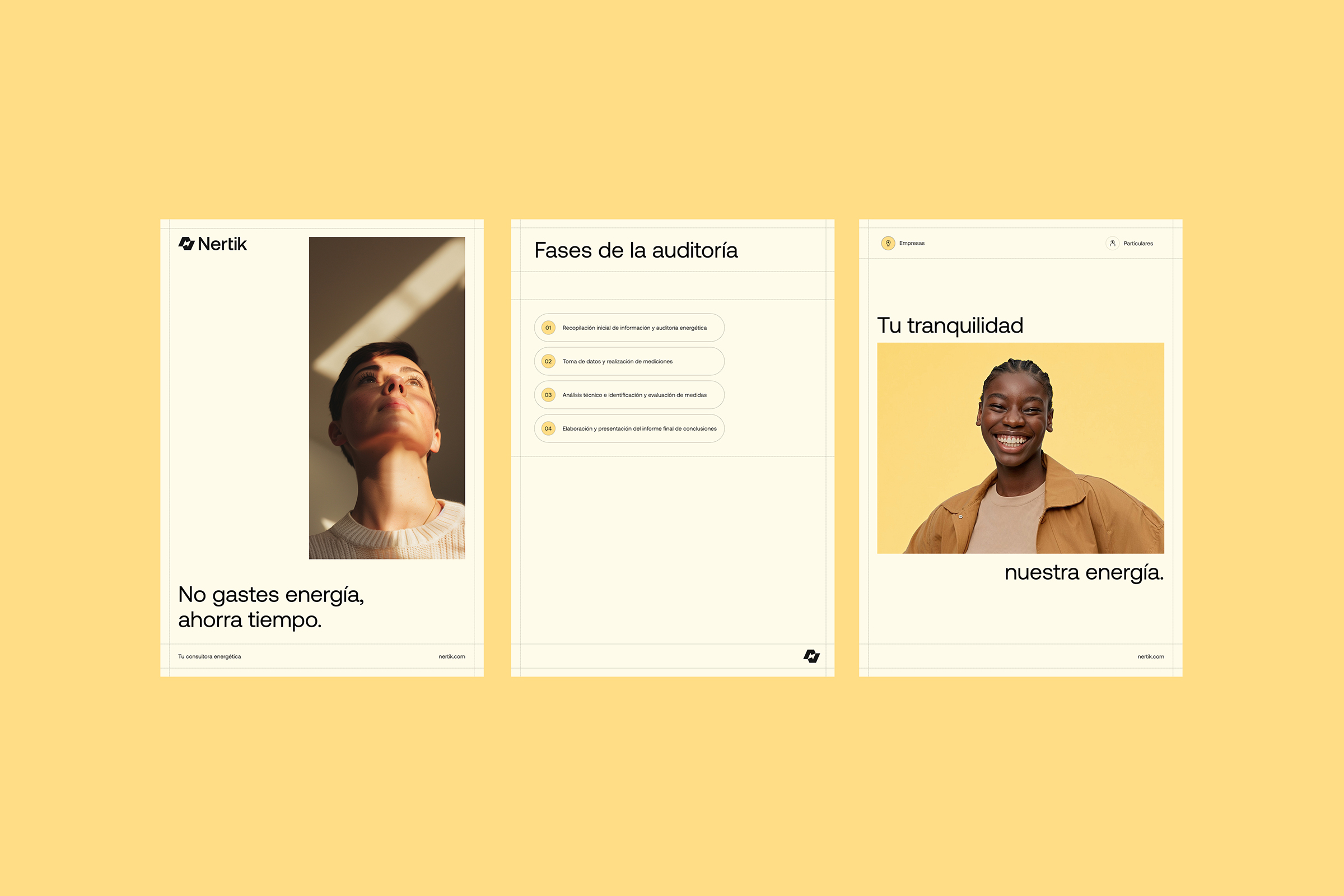
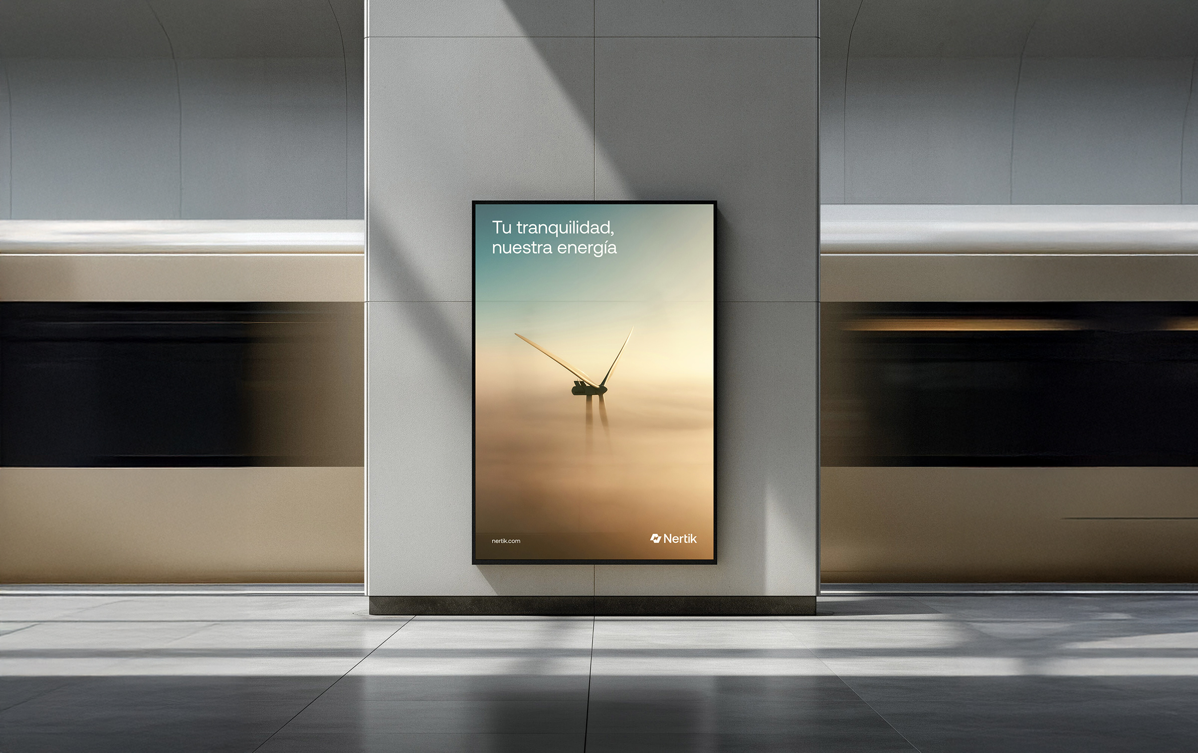
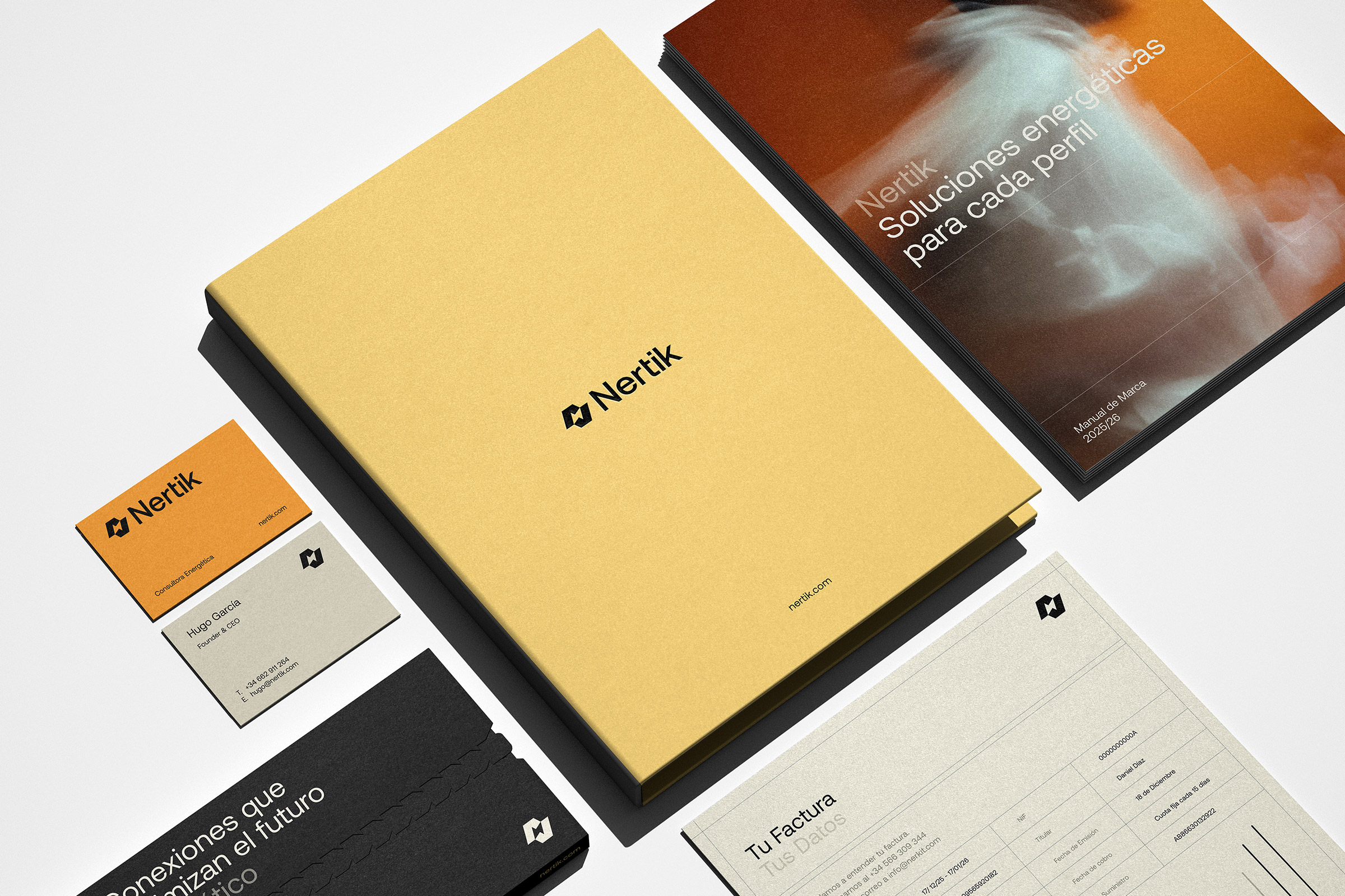
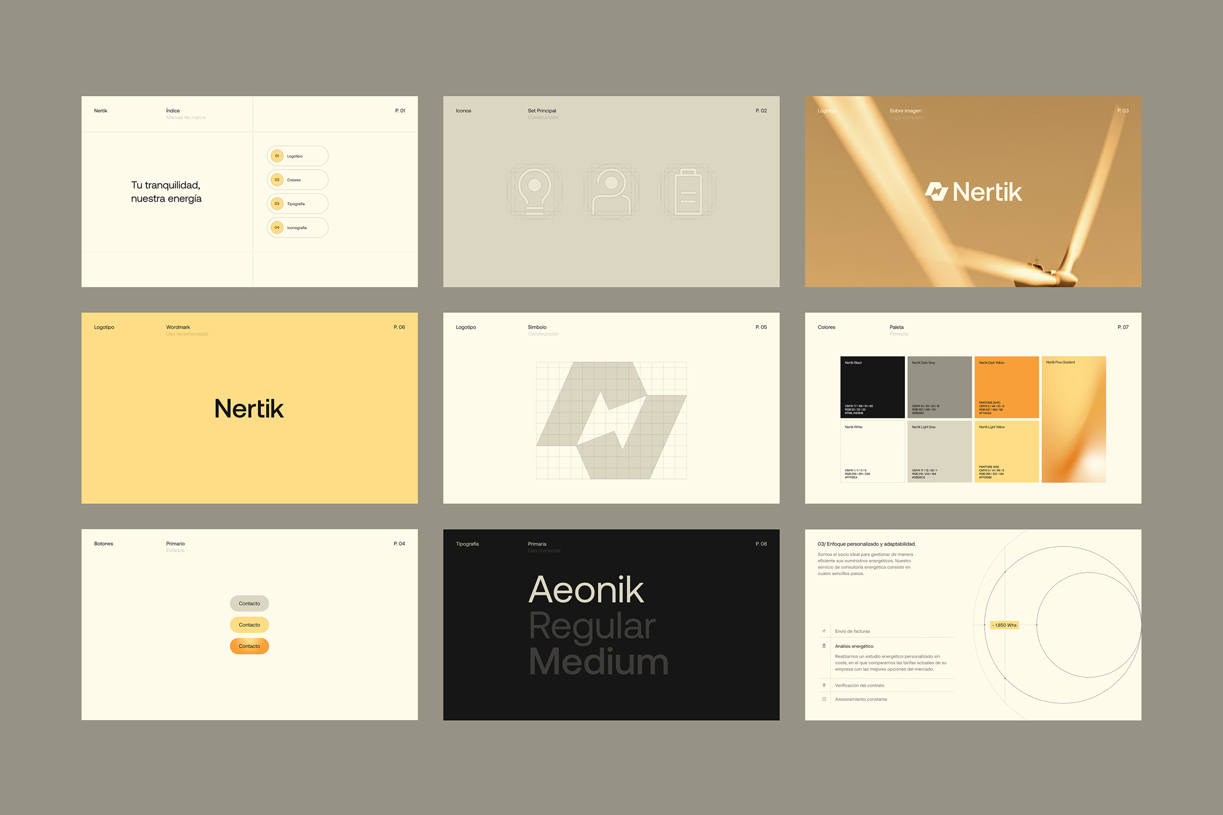
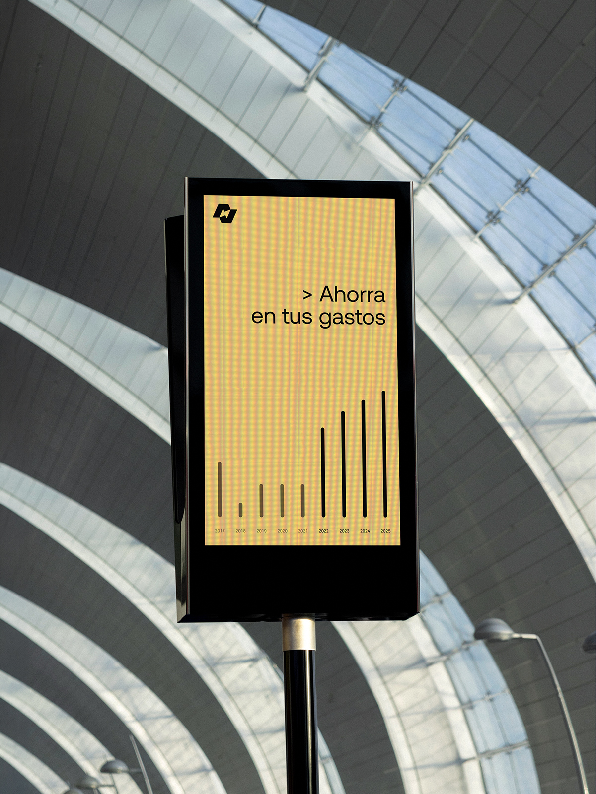
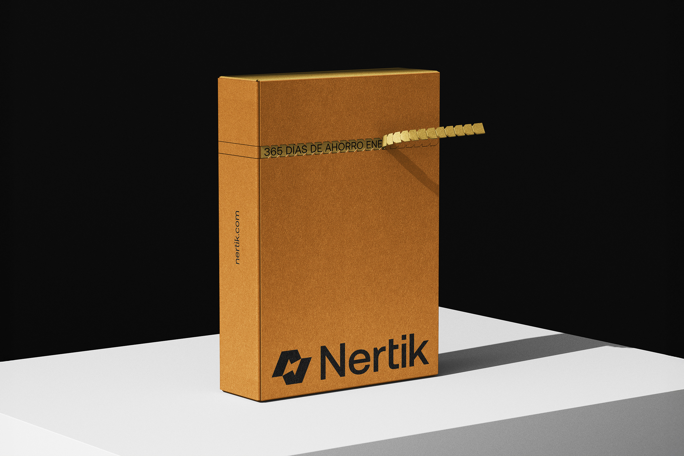
The new identity reflects Nertik’s core values and its role as a partner that guides clients throughout their energy journey. Dotted lines visually represent this idea of guidance and accompaniment, while the gradients and color palette convey the company’s energy, warmth, and approachability.
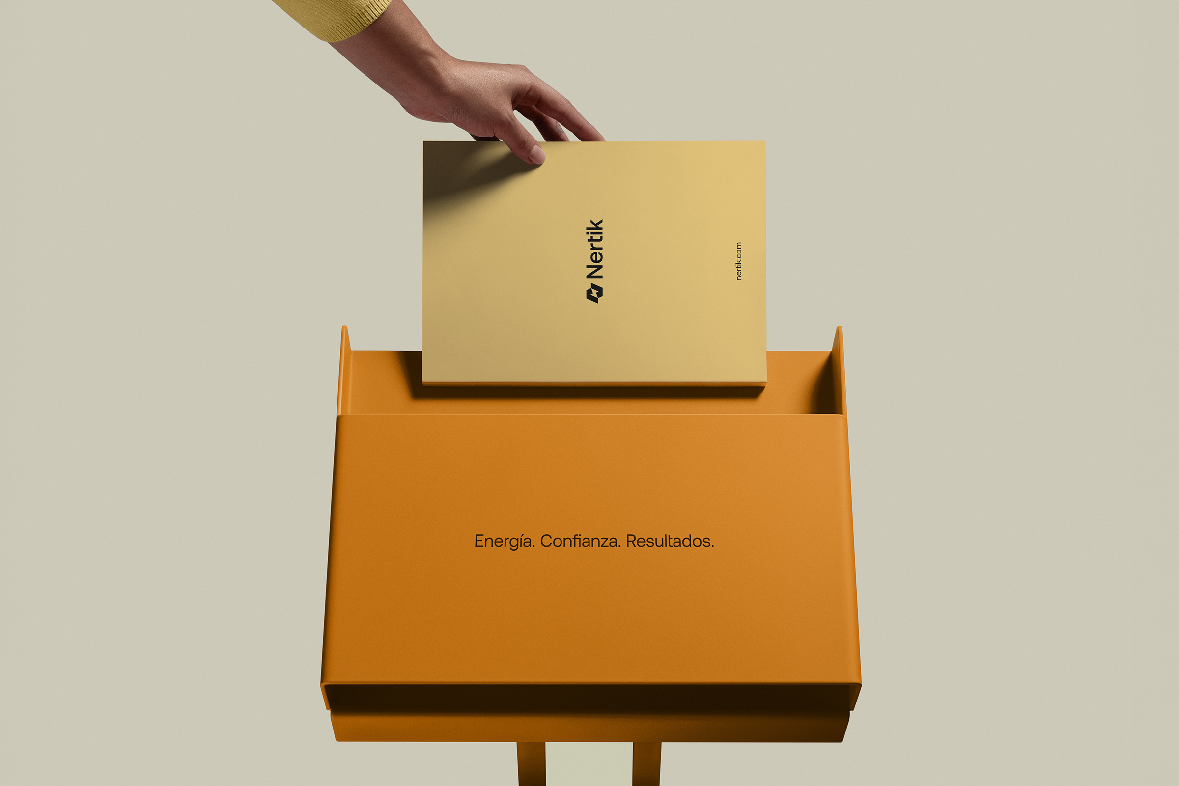
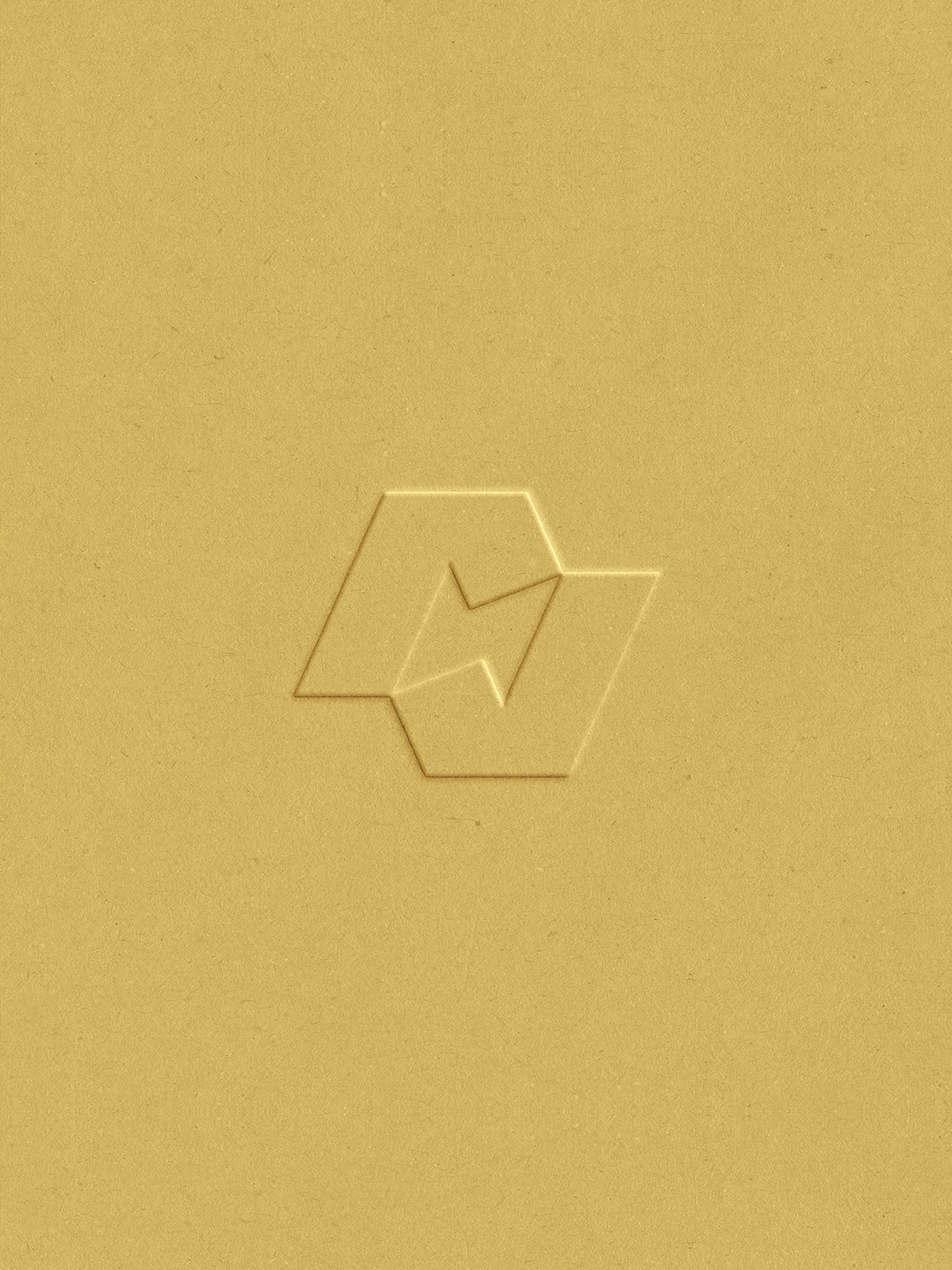
The logo draws inspiration from these same principles. The inner lightning bolt symbolizes energy and the company’s transformative capability. The connected geometry reflects continuity and cyclical movement, representing Nertik’s holistic support to its clients. Subtle angular breaks, reminiscent of a checkmark, reinforce ideas of efficiency, precision, and reliable energy management.
This visual language was also applied to the design of the new website, creating a clear and structured digital experience where content, hierarchy, and visual rhythm work together to naturally guide visitors through the information.
View site
Creative Direction
David Mubien
Account Management
Víctor Mubien
Art Direction
Daniel Iglesias, Javier Ochoa, Carlos Almagro, Patri Orden, Luana Laso, Paula Iglesias
UX/UI
Javier Ochoa, Patri Orden, Luana Laso
Motion Graphics
Daniel Iglesias, Paula Iglesias
Website Development
Ángel Pérez, Hernán Jensen
Copywriting
Eugenia Iturria
The logo draws inspiration from these same principles. The inner lightning bolt symbolizes energy and the company’s transformative capability. The connected geometry reflects continuity and cyclical movement, representing Nertik’s holistic support to its clients. Subtle angular breaks, reminiscent of a checkmark, reinforce ideas of efficiency, precision, and reliable energy management.
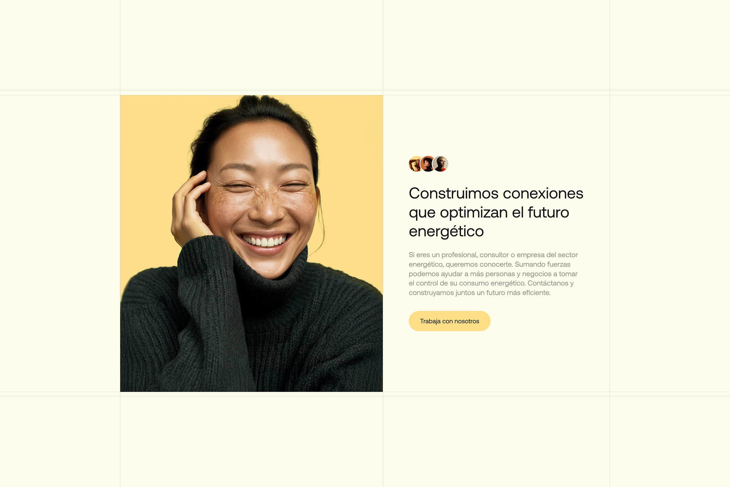
This visual language was also applied to the design of the new website, creating a clear and structured digital experience where content, hierarchy, and visual rhythm work together to naturally guide visitors through the information.
View site
Creative Direction
David Mubien
Account Management
Víctor Mubien
Art Direction
Daniel Iglesias, Javier Ochoa, Carlos Almagro, Patri Orden, Luana Laso, Paula Iglesias
UX/UI
Javier Ochoa, Patri Orden, Luana Laso
Motion Graphics
Daniel Iglesias, Paula Iglesias
Website Development
Ángel Pérez, Hernán Jensen
Copywriting
Eugenia Iturria